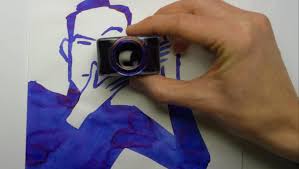
The eight-episode Netflix documentary Abstract: The Art of Design launched on February 10, and the first episode profiles illustrator Christoph Niemann. The work of illustrators makes for better visuals than that of translators, no doubt, and, true to its subject, the show has captivating images and uses special effects and animated drawings to bring Niemann’s creative process to life. In addition to learning how talented, hardworking, and personable Niemann is, we also get a personal look into how he feels about his own work. “I want to become a more ruthless editor, and a more careless artist,” he says at one point, reflecting on his wish to have more open-ended, creative exploration and less confining perfectionism.
As I watched the show, I found myself wondering how similar or different Niemann’s process is to what I do as a translator (beyond one obvious difference: he has a big, beautiful, meticulously-organized studio in Berlin that is to die for). One thing we translators never have to struggle with is the blank page. We never have to wonder, faced with infinite possibilities, where to begin, since we always have a text in front of us that we need to transform into another language. So the question is never what to do, but how to do it.
Visual Language
But, although Niemann has seemingly endless possibilities to choose from when designing a New Yorker cover, there are other illustration jobs that are more specific. I always enjoy the comical, spot-on illustrations of James Surowiecki’s Financial Page column in the New Yorker, and the clever images that David Suter used to come up with on the New York Times‘ op-ed page. In those situations, illustrators need to come up with a way to render an idea as an image. There’s a wide range of possible ways to represent a concept or topic visually, but the illustrator is seeking the image that expresses it the best — most clearly, most concisely, and most cleverly.
Translators also deal with a variety of choices, and need to select the one that is most clear and concise. Other values, if present in the original, may also need to come through, such as maintaining the tone of the language — expressing the humor, cleverness, poetic effects, or any other special features as much as possible.
Looking at Alternatives
So, as translators, we’re always faced with a range of alternatives. Often I find myself inserting lists of them into my drafts, such as “shouted/cried/exclaimed/said” or “sadness/pain/suffering.” I used to worry that I was overusing this strategy, applying the technique so often that my drafts were too full of choices and left too many problems unsolved. But then I realized that when reading over a draft and getting a sense of the whole, I’m usually able to choose the word I want quickly and instinctively. It suddenly jumps out at me that “exclaimed” and “suffering” are right in this particular context.
Translators have less freedom than illustrators. But illustrators are also translators, of a sort. They’re trying to express ideas or concepts in a visual language, while we’re trying to take them from one language and express them in another.

